import pandas as pd
import numpy as np
import matplotlib.pyplot as plt
import seaborn as sns
import morethemes as mt
from scipy import stats

# Set WSJ theme
mt.set_theme("wsj")

data = pd.read_csv('cleaned_data.csv')TessX | Baseline Model
Pricing Analytics
Feature Engineering & Baseline Model
Now that we’ve explored the data and gained insights, it’s time to prepare the dataset for modeling. In this section, we will focus on transforming the raw data into a format that improves model performance.
If you want to see the insights we discovered while exploring the data through questions, click here.
What We’ll Do:
- Univariate Analysis – Examine individual features to understand their distributions and spot potential issues.
- Missing Value Analysis – Identify and handle missing values to ensure a clean dataset.
- Target Variable Analysis – Analyze the target variable to detect patterns and ensure it’s well-defined for modeling.
- Categorical Encoding – Convert categorical variables into numerical format using One-Hot Encoding.
How This Fits into Our Pipeline
Every insight gained here will be incorporated into our preprocessing pipeline.
Load libraries & data
Univariate analysis
Code
# Define numerical columns
numerical_cols = ['Horsepower', 'Torque', 'Highway Fuel Economy']

# Set figure size (Reduce height)
fig, axes = plt.subplots(len(numerical_cols), 3, figsize=(8, 3 * len(numerical_cols)))

# Add General Title (Reduce font size)
fig.suptitle("Univariate Analysis", fontsize=20, fontweight="bold")

# Loop through each numerical column
for i, col in enumerate(numerical_cols):
    # Histogram
    sns.histplot(data[col].dropna(), bins=20, kde=True, ax=axes[i, 0])
    axes[i, 0].set_title(f'Histogram of {col}', fontsize=10)


    # QQ Plot
    res = stats.probplot(data[col].dropna(), dist="norm", plot=axes[i, 1])
    axes[i, 1].get_lines()[0].set_color("#855c75")
    axes[i, 1].get_lines()[1].set_color("red")
    axes[i, 1].set_title(f'QQ Plot of {col}', fontsize=10)


    # Box Plot
    sns.boxplot(x=data[col], ax=axes[i, 2])
    axes[i, 2].set_title(f'Box Plot of {col}', fontsize=10)


fig.suptitle("Univariate Analysis", fontsize=20, fontweight="bold")


# Adjust layout (More space for title)
plt.tight_layout(rect=[0, 0, 1, 0.92])  # Reduce the top margin
plt.subplots_adjust(wspace=0.3, hspace=0.6, top=0.85)  # Adjust subplot spacing

plt.show()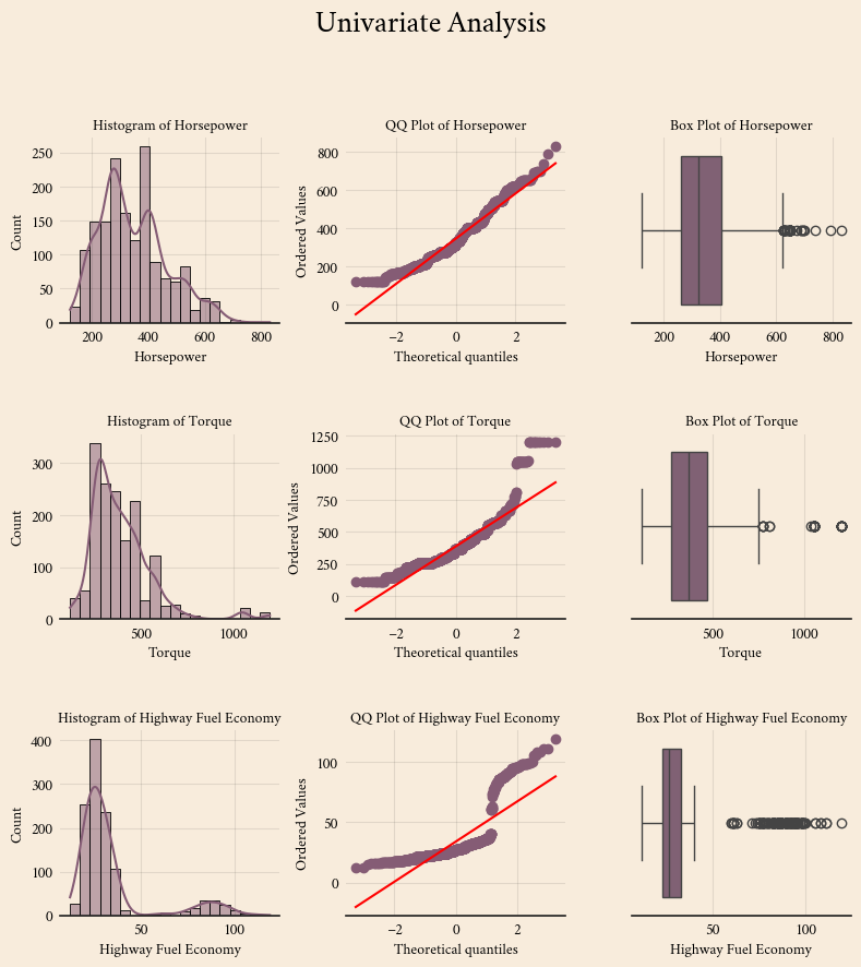
Missing value analysis
missing_values = data.isnull().sum()  # Count missing values
total_values = len(data)  # Total number of rows
missing_percentage = (missing_values / total_values) * 100  # Calculate percentage

# Combine into a DataFrame for better visualization
missing_data = pd.DataFrame({'Missing Values': missing_values, 'Percentage': missing_percentage})
missing_data = missing_data[missing_data['Missing Values'] > 0]  # Show only columns with missing values

print(missing_data)
Missing Values Percentage
Horsepower 5 0.310559
Torque 27 1.677019
Highway Fuel Economy 424 26.335404
Cylinders 165 10.248447Code
# Assuming you have a DataFrame named 'data'
missing_values = data.isnull().sum()  # Count missing values
total_values = len(data)  # Total number of rows
missing_percentage = (missing_values / total_values) * 100  # Calculate percentage

# Combine into a DataFrame for better visualization
missing_data = pd.DataFrame({'Missing Values': missing_values, 'Percentage': missing_percentage})
missing_data = missing_data[missing_data['Missing Values'] > 0]  # Show only columns with missing values

# Plot the missing data
plt.figure(figsize=(9, 4))
plt.bar(missing_data.index, missing_data['Percentage'])
plt.ylabel('Percentage of Missing Values')
plt.title('Missing Values Percentage Per Column')

# Show plot

plt.show()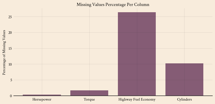
Important
I will use median imputation for numerical columns because my univariate analysis shows that the numerical features are skewed. For categorical features, I will impute missing values using the most frequent category.
Target variable analysis
Code
# Set figure size (Reduced for better fit)
fig, axes = plt.subplots(1, 3, figsize=(8, 4))

# Add General Title (Smaller font for better fit)
fig.suptitle("Target Variable Analysis", fontsize=20, fontweight="bold")

# Histogram
sns.histplot(data['MSRP'].dropna(), bins=30, kde=True, ax=axes[0])
axes[0].set_title("Histogram of MSRP", fontsize=10)

# QQ Plot

res = stats.probplot(data['MSRP'].dropna(), dist="norm", plot=axes[1])
axes[1].get_lines()[0].set_color("#855c75")
axes[1].get_lines()[1].set_color("red")
axes[1].set_title("QQ Plot of MSRP", fontsize=10)


# Box Plot
sns.boxplot(x=data['MSRP'], ax=axes[2])
axes[2].set_title("Box Plot of MSRP", fontsize=10)

# Adjust layout (Reduce spacing)
plt.tight_layout(rect=[0, 0, 1, 0.93])
plt.subplots_adjust(wspace=0.4)  # Adjust space between subplots


plt.show()
Categorical encoding
Converting Categorical Variables to Numerical Format
To use categorical variables in our model, we need to convert them into a numerical format. We will apply One-Hot Encoding, which creates separate binary columns (0 or 1) for each category.
Example: One-Hot Encoding
Consider a categorical feature called “Car_Type” with three unique values: "Sedan", "SUV", and "Truck".
| Car_Type | Sedan | SUV | Truck |
|---|---|---|---|
| Sedan | 1 | 0 | 0 |
| SUV | 0 | 1 | 0 |
| Truck | 0 | 0 | 1 |
| SUV | 0 | 1 | 0 |
Each category is converted into its own column, where 1 indicates the presence of that category, and 0 means it’s absent.
This encoding method ensures that the model treats categorical variables properly without assuming any ordinal relationship between them.
Insights so far
I will try a log transformation for the target variable.
For categorical columns, I will try one-hot encoding.
I will add a standard scaler to the pipeline.
There are outliers in the independent variables, but I will not take action until I build and diagnose the model. However, I need to watch out for high fuel economy.
How log transformation will appear in the pipeline
Code
from feature_engine.transformation import LogTransformer

# Copy data to avoid modification
data_transformed = data.copy()

# Apply Log Transformation
lt_target = LogTransformer(variables=["MSRP"])
data_transformed = lt_target.fit_transform(data_transformed)

# Create figure with two rows (Before & After)
fig, axes = plt.subplots(2, 3, figsize=(8, 5))

# Titles
fig.suptitle("MSRP: Before and After Log Transformation", fontsize=20, fontweight='bold')

# BEFORE Log Transformation
sns.histplot(data['MSRP'].dropna(), bins=30, kde=True, ax=axes[0, 0])
axes[0, 0].set_title("Histogram (Before)", fontsize=10)

# QQ Plot
res = stats.probplot(data['MSRP'].dropna(), dist="norm", plot=axes[0, 1])
axes[0, 1].get_lines()[0].set_color("#855c75")
axes[0, 1].get_lines()[1].set_color("red")
axes[0, 1].set_title("QQ Plot (Before)", fontsize=10)


sns.boxplot(x=data['MSRP'], ax=axes[0, 2])
axes[0, 2].set_title("Box Plot (Before)", fontsize=10)

# AFTER Log Transformation
sns.histplot(data_transformed['MSRP'].dropna(), bins=30, kde=True, ax=axes[1, 0])
axes[1, 0].set_title("Histogram (After Log)", fontsize=10)

# QQ Plot (After Log Transformation)
res = stats.probplot(data_transformed['MSRP'].dropna(), dist="norm", plot=axes[1, 1])
axes[1, 1].get_lines()[0].set_color("#855c75")
axes[1, 1].get_lines()[1].set_color("red")
axes[1, 1].set_title("QQ Plot (After Log)", fontsize=10)


sns.boxplot(x=data_transformed['MSRP'], ax=axes[1, 2])
axes[1, 2].set_title("Box Plot (After Log)", fontsize=10)

# Adjust layout
plt.tight_layout(rect=[0, 0, 1, 0.95])  # Adjust title spacing
plt.subplots_adjust(wspace=0.4, hspace=0.6)  # Reduce gaps between plots


plt.show()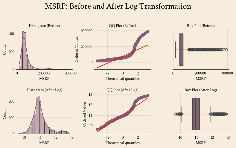
Log Transformation: Handling Skewed Data
Log transformation is a technique used to reduce skewness in numerical data, making distributions more normal-like and improving model performance. It is especially useful when a feature has a long tail with extreme values.
Why Use Log Transformation?
- Reduces skewness in right-skewed data.
- Stabilizes variance, making patterns easier to detect.
- Improves model performance by handling large differences in scale.
Example: Before & After Log Transformation
Consider a feature called “Price”, which has highly skewed values:
| Original Price ($) | Log-Transformed Price (log₁₀) |
|---|---|
| 1,000 | 3.00 |
| 10,000 | 4.00 |
| 50,000 | 4.70 |
| 100,000 | 5.00 |
| 500,000 | 5.70 |
Here, applying log₁₀(x) compresses large values, making the distribution more balanced.
When to Use Log Transformation
- When a numerical feature is right-skewed.
- When the data has large variations in magnitude.
- When the feature contains positive values only (since log of negative values is undefined).
Formula:
For natural log (base e):
\[
x' = \log(x)
\]
For log base 10:
\[
x' = \log_{10}(x)
\]
Log transformation helps models learn better by making relationships more linear and reducing the impact of outliers.
Modeling - Baseline Model
from sklearn.model_selection import train_test_split
from sklearn.linear_model import LinearRegression
from sklearn.feature_selection import RFE
from sklearn.preprocessing import StandardScaler, OneHotEncoder
from sklearn.compose import ColumnTransformer
from sklearn.pipeline import Pipeline
from sklearn.impute import SimpleImputer
from sklearn.metrics import mean_squared_error, mean_absolute_error, r2_score

data = pd.read_csv('cleaned_data.csv')
# Define numerical and categorical columns
numerical_columns = ['Horsepower', 'Torque', 'Highway Fuel Economy']
categorical_columns = ['Make', 'Year', 'Body Size', 'Body Style',
'Engine Aspiration', 'Drivetrain', 'Transmission','Cylinders']X = data.drop("MSRP", axis=1)
y = data["MSRP"]# Split into training and test sets (80% train, 20% test)
X_train, X_test, y_train, y_test = train_test_split(X, y, test_size=0.2, random_state=42)
# Log-transform targets (after splitting the data)
y_train_log = np.log1p(y_train)
y_test_log = np.log1p(y_test)
# Define preprocessing pipeline
numerical_pipeline = Pipeline([
('imputer', SimpleImputer(strategy='median')),
('scaler', StandardScaler())
])
categorical_pipeline = Pipeline([
('imputer', SimpleImputer(strategy='most_frequent')),
('encoder', OneHotEncoder(handle_unknown='ignore'))
])
# Combine both pipelines
preprocessor = ColumnTransformer([
('num', numerical_pipeline, numerical_columns),
('cat', categorical_pipeline, categorical_columns)
])
# Create the final pipeline with Linear Regression
model_pipeline = Pipeline([
('preprocessor', preprocessor),
('model', LinearRegression())
])
# Train the model using the log-transformed targets
model_pipeline.fit(X_train, y_train_log)
# Predictions using the log-transformed targets
y_train_pred_log = model_pipeline.predict(X_train)
y_test_pred_log = model_pipeline.predict(X_test)
# Convert log-transformed predictions back to original scale
y_train_pred = np.expm1(y_train_pred_log)
y_test_pred = np.expm1(y_test_pred_log)
# Evaluate the model on both training and test sets
def evaluate_model(y_true, y_pred, dataset_type="Test"):
r2 = r2_score(y_true, y_pred)
mse = mean_squared_error(y_true, y_pred)
rmse = np.sqrt(mse)
mae = mean_absolute_error(y_true, y_pred)
print(f"\n📊 {dataset_type} Set Performance:")
print(f"R² Score: {r2:.4f}")
print(f"MSE: {mse:.2f}")
print(f"RMSE: {rmse:.2f}")
print(f"MAE: {mae:.2f}")
return r2, mse, rmse, mae
# Print metrics for both sets
train_metrics = evaluate_model(y_train, y_train_pred, "Training")
test_metrics = evaluate_model(y_test, y_test_pred, "Test")
# --- Plot results (on test set) ---
plt.figure(figsize=(8, 6))
# 1️⃣ Residual Plot
plt.subplot(2, 2, 1)
sns.residplot(x=y_test, y=y_test_pred, lowess=True, line_kws={"color": "red"})
plt.xlabel("Actual MSRP", fontsize=9)
plt.ylabel("Residuals", fontsize=9)
plt.title("Residual Plot", fontsize=10)
# 2️⃣ Predicted vs Actual
plt.subplot(2, 2, 2)
sns.scatterplot(x=y_test, y=y_test_pred, alpha=0.6)
plt.plot([y_test.min(), y_test.max()], [y_test.min(), y_test.max()], 'r--')
plt.xlabel("Actual MSRP", fontsize=9)
plt.ylabel("Predicted MSRP", fontsize=9)
plt.title("Predicted vs Actual", fontsize=10)
# 3️⃣ Distribution of Errors
plt.subplot(2, 2, 3)
sns.histplot(y_test - y_test_pred, bins=25, kde=True)
plt.xlabel("Prediction Error", fontsize=9)
plt.title("Error Distribution", fontsize=10)
# 4️⃣ QQ Plot
plt.subplot(2, 2, 4)
res = stats.probplot(y_test - y_test_pred, dist="norm", plot=plt)
plt.gca().get_lines()[0].set_color("#855c75")
plt.gca().get_lines()[1].set_color("red")
plt.title("QQ Plot of Errors", fontsize=10)
plt.xlabel("Theoretical Quantiles", fontsize=9)
plt.ylabel("Sample Quantiles", fontsize=9)
# Adjust layout
plt.tight_layout()
plt.subplots_adjust(hspace=0.4, wspace=0.3) # Adjust spacing between plots
plt.show()
📊 Training Set Performance:
R² Score: 0.9227
MSE: 236503194.57
RMSE: 15378.66
MAE: 8257.33

📊 Test Set Performance:
R² Score: 0.9339
MSE: 186273348.91
RMSE: 13648.20
MAE: 8072.74
Code
# --- Show All Features ---
numerical_features = numerical_columns

categorical_transformer = model_pipeline.named_steps['preprocessor'].named_transformers_['cat']
categorical_features = categorical_transformer.named_steps['encoder'].get_feature_names_out(categorical_columns)

all_feature_names = np.concatenate([numerical_features, categorical_features])


# --- Feature Importance ---
model = model_pipeline.named_steps['model']
feature_importance = model.coef_

# Combine feature names with their importance
feature_importance_dict = dict(zip(all_feature_names, feature_importance))


# Sort features by absolute importance (highest to lowest)
sorted_features = sorted(feature_importance_dict.items(), key=lambda x: abs(x[1]), reverse=True)

# Extract feature names and importance values
features, importance_values = zip(*sorted_features)

# Create bar plot
plt.figure(figsize=(6.9, 9))
plt.barh(features, importance_values)
plt.xlabel("Feature Importance")
plt.ylabel("Features")
plt.title("Feature Importance (Sorted)")
plt.gca().invert_yaxis()  # Invert y-axis to show highest importance at the top


plt.show()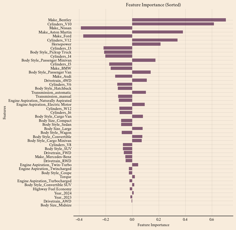
Model Performance
The model’s performance on both the training and test sets is as follows:
Training Set:
- R² Score: 0.9227
- MSE: 236,503,182.49
- RMSE: 15,378.66
- MAE: 8,257.33
Test Set:
- R² Score: 0.9339
- MSE: 186,273,410.20
- RMSE: 13,648.20
- MAE: 8,072.74
At first glance, the model appears to generalize well. However, it is unusual for the test set to perform better than the training set.
Investigating the unexpected test performance
Typically, a model performs slightly worse on the test set because it encounters new, unseen data. When the test set outperforms the training set, potential causes include:
- Small Dataset Bias: If the dataset is small, the train-test split may not be fully representative, and a fortunate split could make the test set easier to predict.
- Solution: Use k-fold cross-validation to obtain a more reliable estimate of model performance.
This discrepancy is not necessarily a major issue, but it presents an opportunity to refine the model and ensure its robustness.
Keeping the model efficient
Currently, the model uses 48 features to predict car prices. However, not all features contribute equally to predictive accuracy. Some have a strong impact on pricing, while others provide little to no value.
Features with high impact:
- Make_Bentley (0.7065): Luxury brands significantly influence pricing.
- Cylinders_V10 (0.6165): A higher number of cylinders generally leads to higher prices.
Features with minimal impact:
- Drivetrain_AWD (-0.0028): Little to no effect on pricing.
- Body Size_Midsize (0.0021): Negligible influence.
Including unnecessary features can overcomplicate the model and reduce its stability. To address this, we will apply Recursive Feature Elimination (RFE).
Next Steps
Rather than manually selecting features, RFE will:
- Systematically remove the least useful features.
- Retain only features that significantly improve predictions.
- Enhance model accuracy while reducing complexity.
At this stage, the model serves as a baseline. The next step is to optimize the feature set, ensuring the pricing tool remains both powerful and efficient.
Go to the next notebook to continue: Click here